Painting FDM Miniatures: Primer and Paint Experiments
Greetings, filament friends! Welcome to Fighting Filament, my blog around miniature printing and hobbying. If you enjoy the content of this article, please consider a free subscription. You'll get email updates for all my new posts around FDM miniatures and hobbying.
FDM-printed miniatures; they are dirt-cheap, easy to work with, and increasingly detailed with each new generation of printers. However, they all possess the same fundamental flaws. These come in the form of layer lines, rough support interfaces and poor surface quality on overhangs. Overcoming these downsides dominates the conversation around FDM figures.
In today's upload, we'll be conducting a small, controlled experiment to see how we can cut down on layer lines using painting. Using identical prints, two primer types, and two common painting approaches, I wanted to see where effort translates into visible improvement.
The Setup
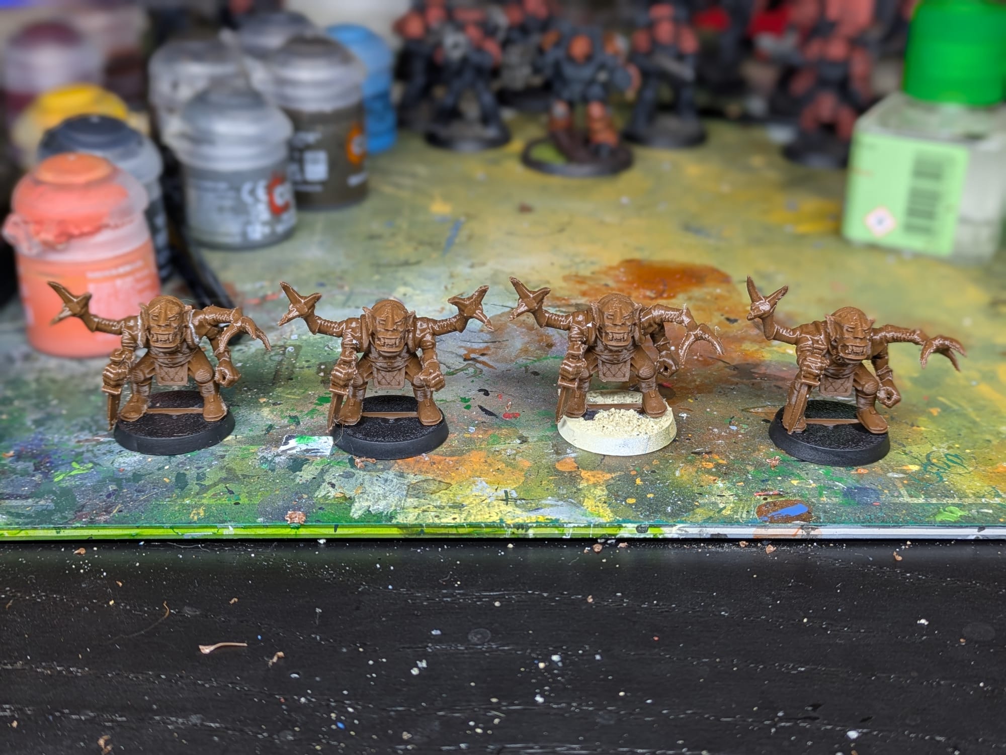
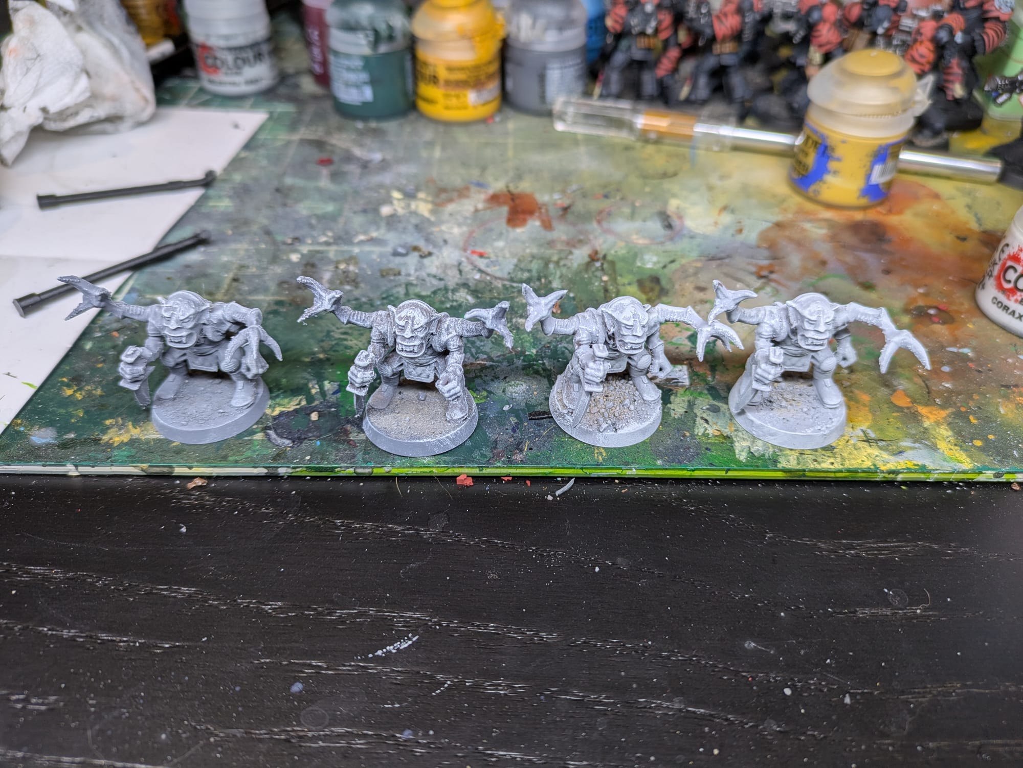
All four miniatures used in this test were printed together as a single batch. They were produced from the same file, on the same printer, using the same filament spool and slicer profile. Orientation, supports, and layer height were kept identical. After printing, the only cleanup performed was basic support removal. No sanding, filling, or surface smoothing was done.
From that point forward, the experiment introduced only two variables: primer choice and painting technique.
Two of the models received a standard primer. The other two were primed with a filler primer. From each primer group, one model was painted using contrast paints, while the other was painted entirely with traditional acrylic miniature paints.
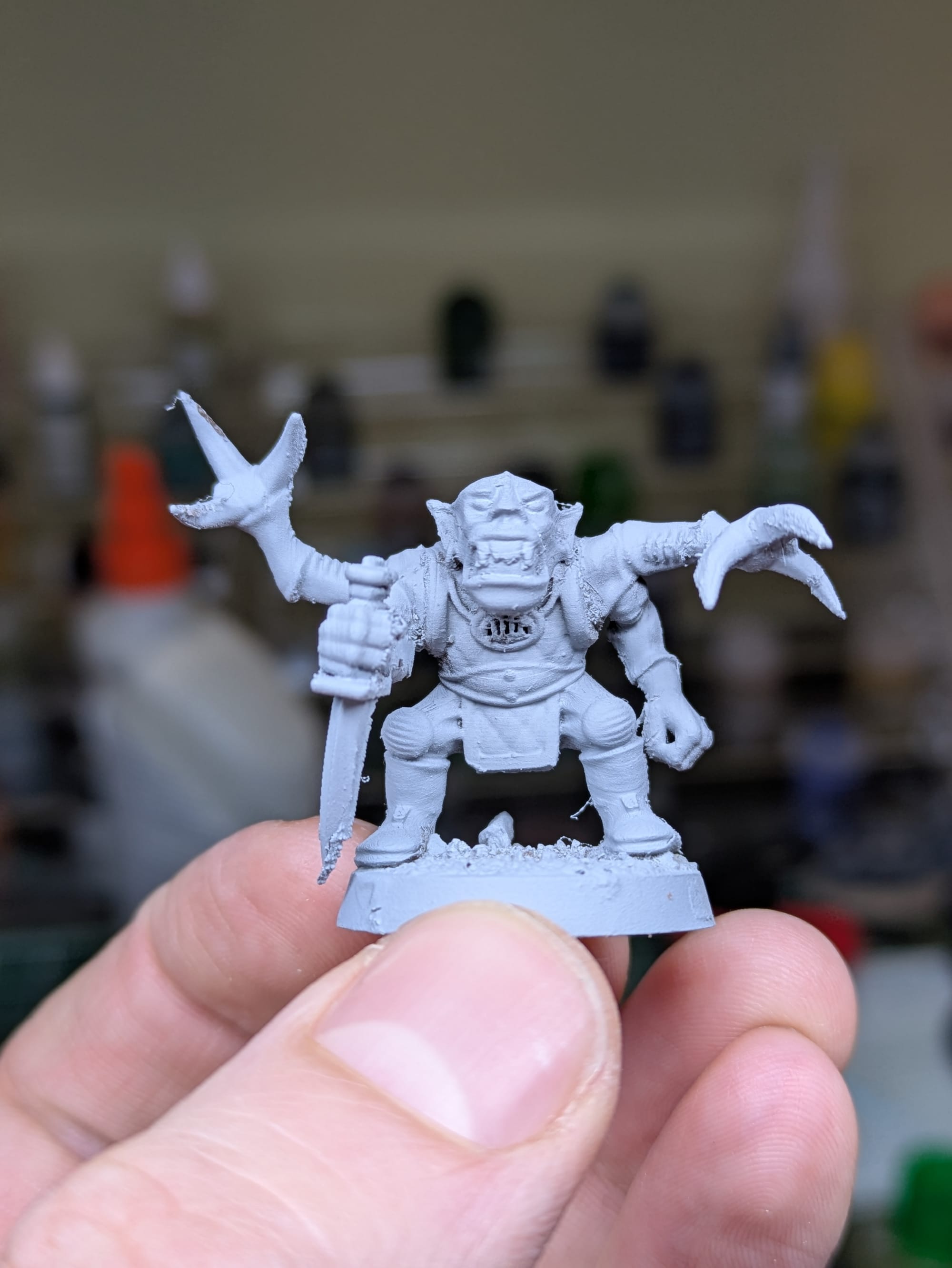
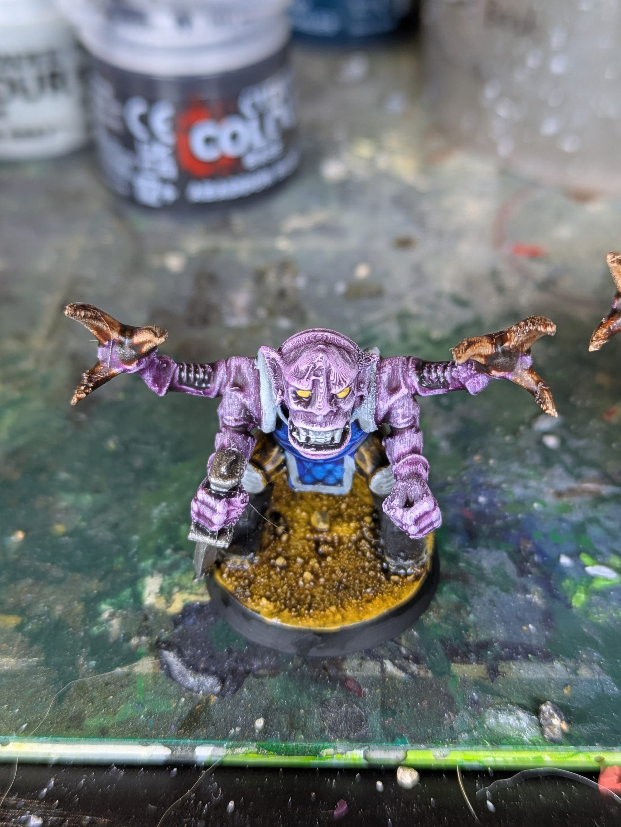
The Test Miniature: Retro Hybrid Orks
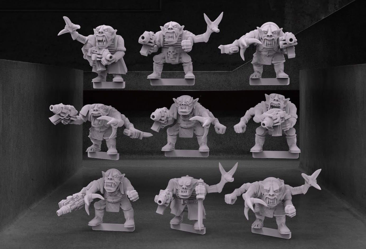
Hybrid orks, AKA genestealer hybrids.
For those who haven't read my first post, I am a huge fan of the miniature sculptor BigMrTong. He is the best rogue-trader and oldhammer 40k-style miniature sculptor around, and his simple yet distinctive models are perfect for FDM printing. I've chosen to use one of his very cool Ork Hybrid models for this experiment.
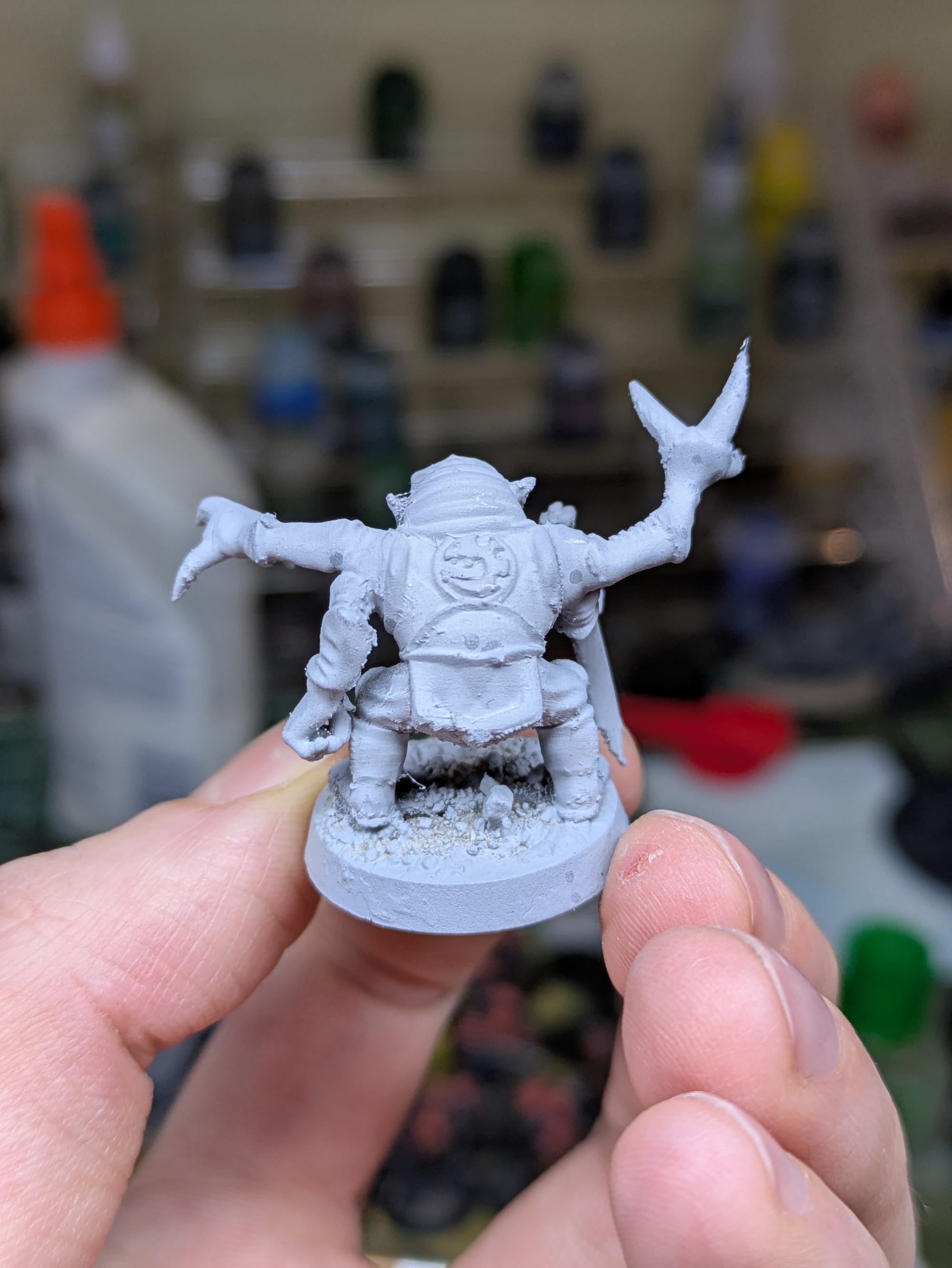
First Impressions: Unprimed FDM Prints
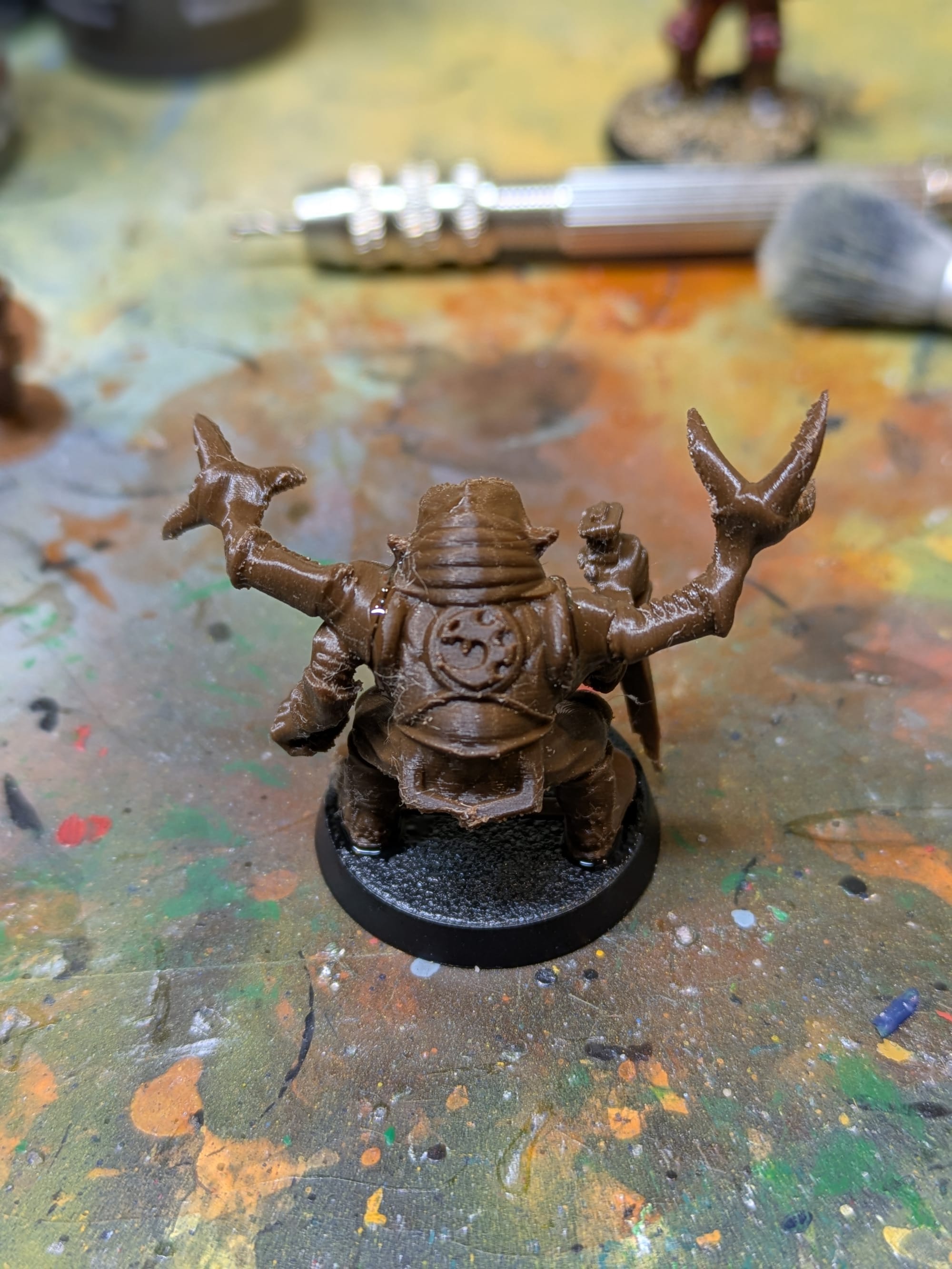
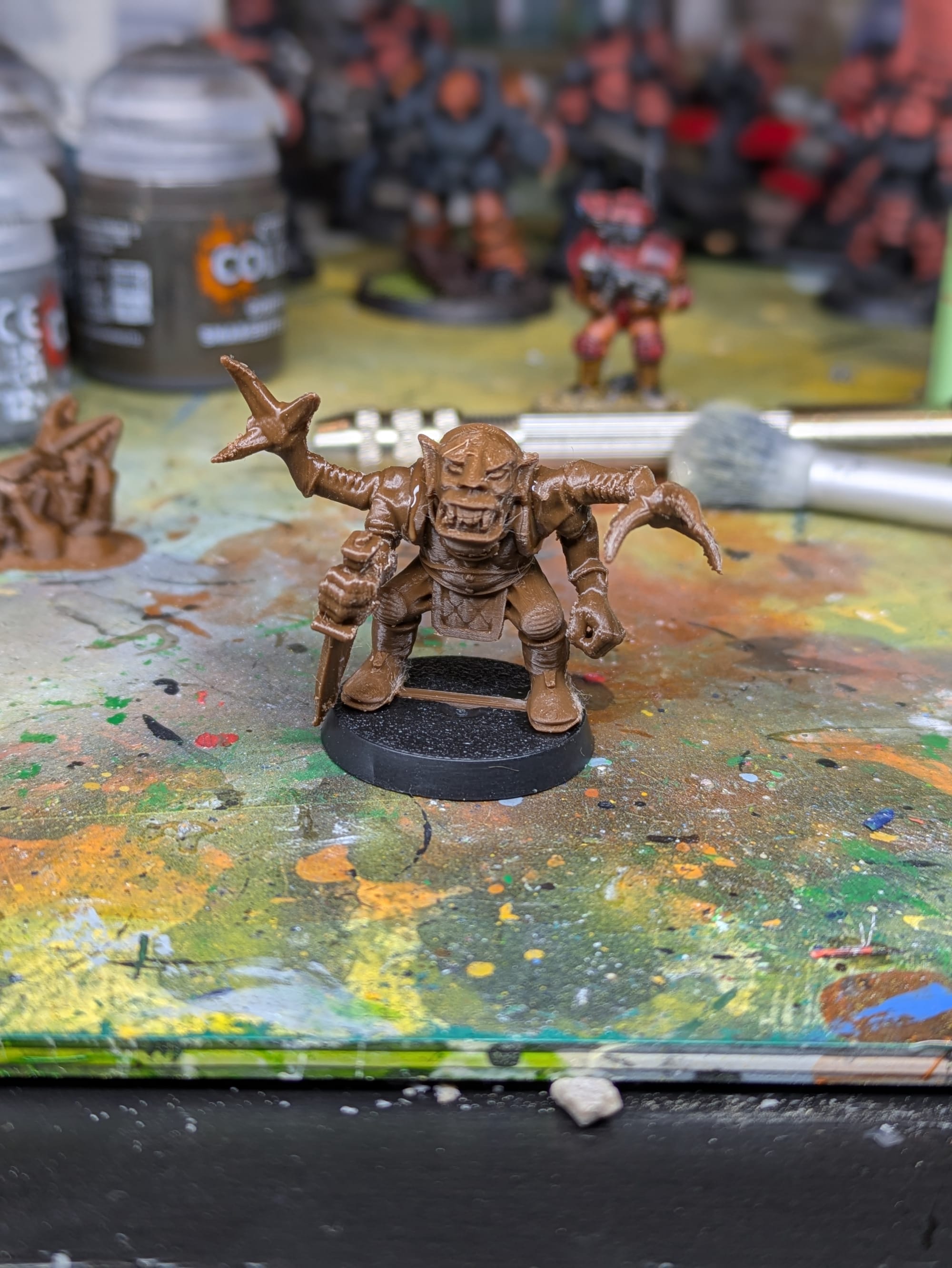
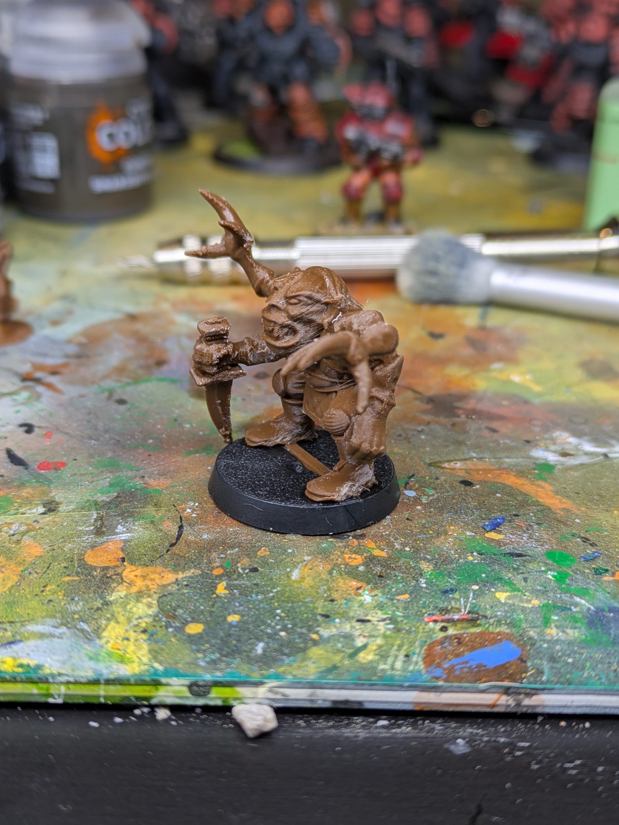
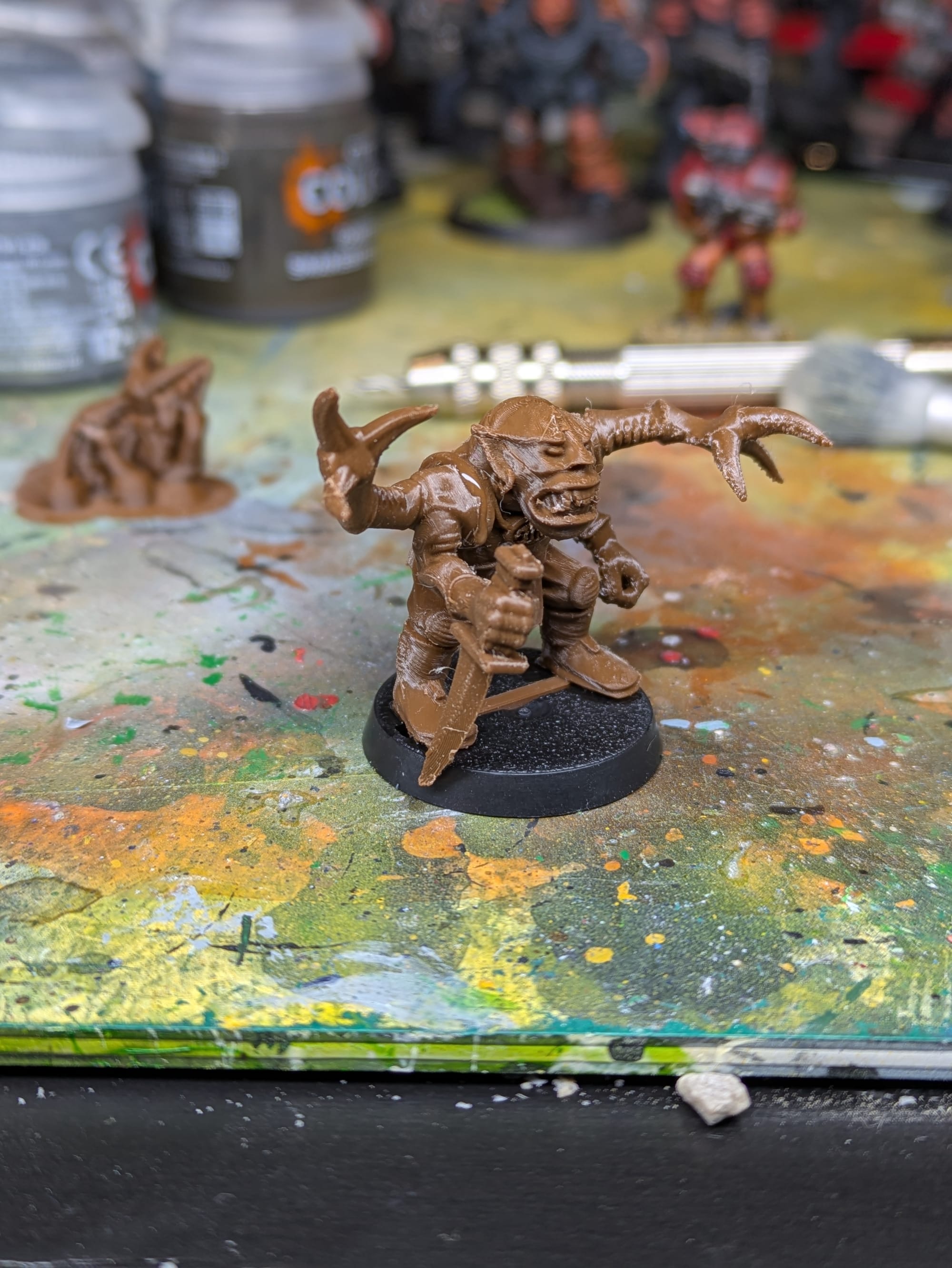
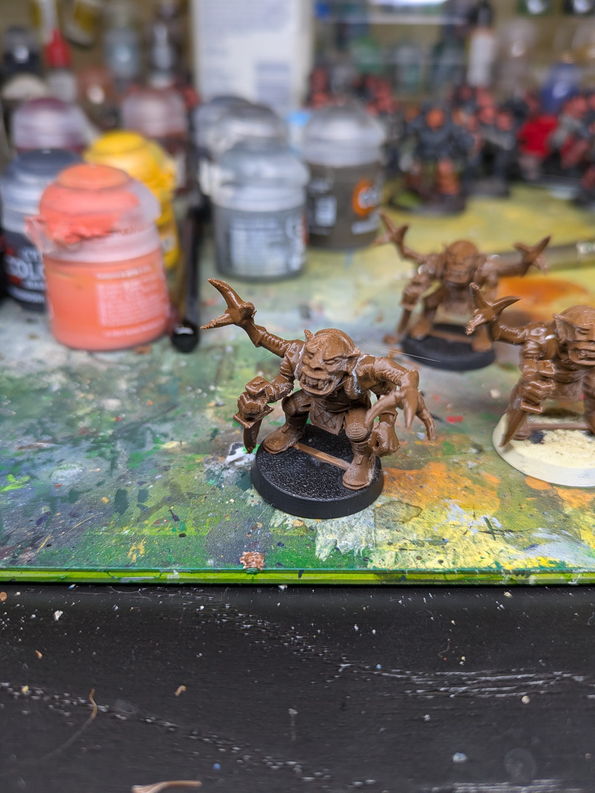
Before any paint or primer was applied, it was useful to look at the raw prints and look at what kind of artifacts I am trying to hide. I used my 0.05 layer height Balanced XL Miniatures Profile, from my earlier article, to print these, and I think they all turned out quite well. The layer lines on them are fairly minimal, and the support scarring isn't too bad either. Printing the models with separate limbs really helped with this.
It is also worth noting that any layer lines your see are far more noticeable under strong lighting or close-up photography than they are at tabletop distance.
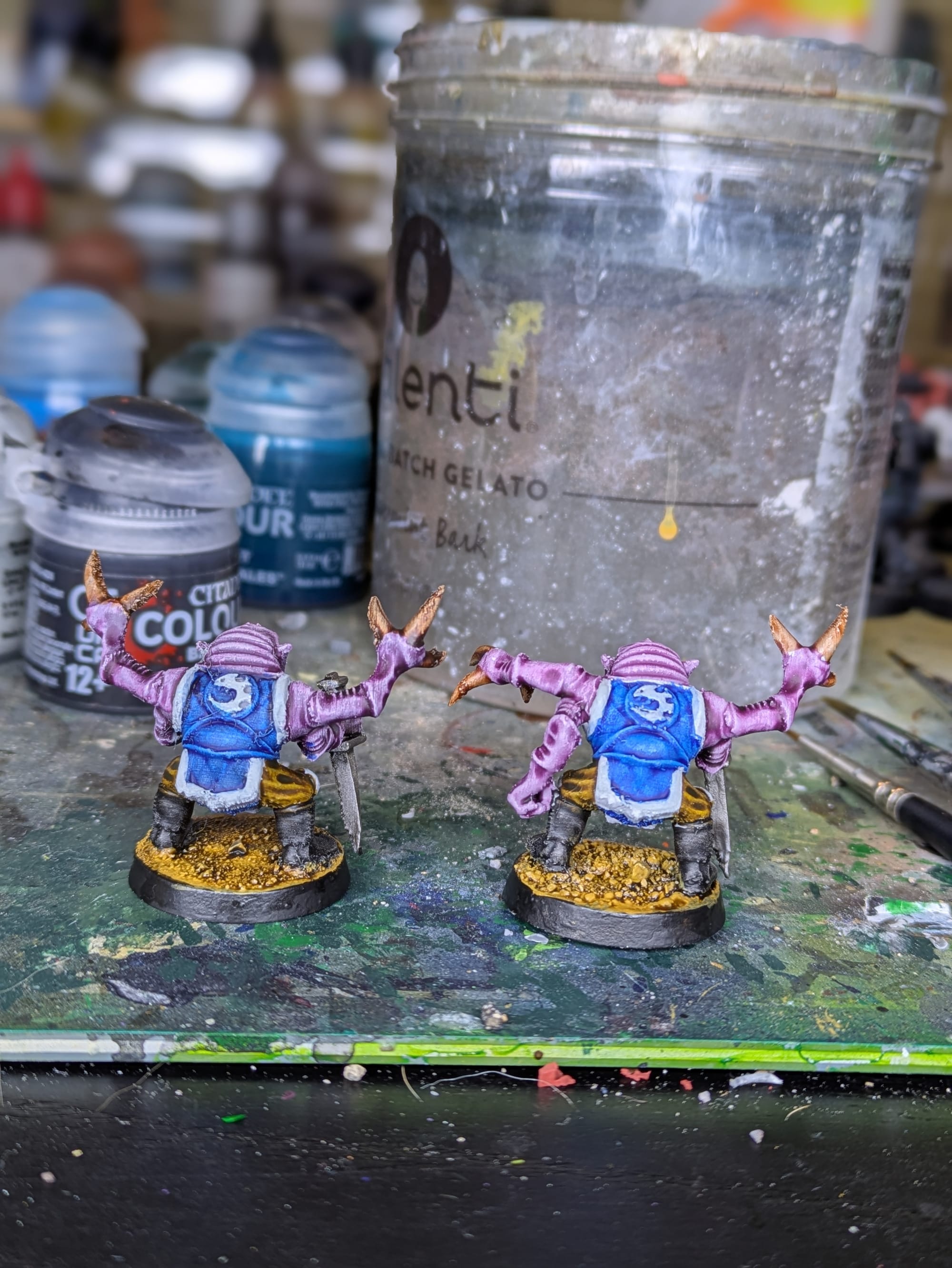
Primer Comparison
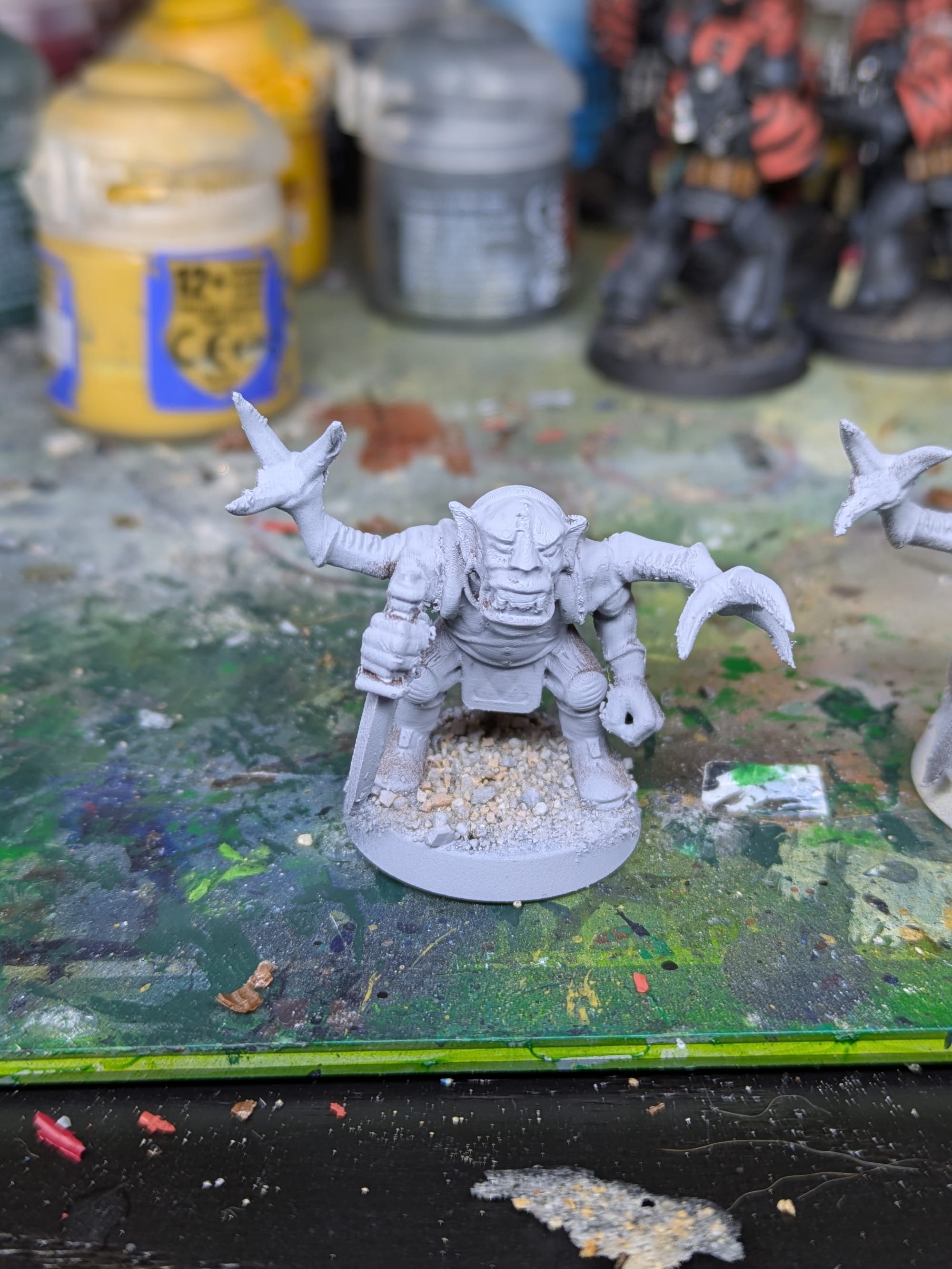
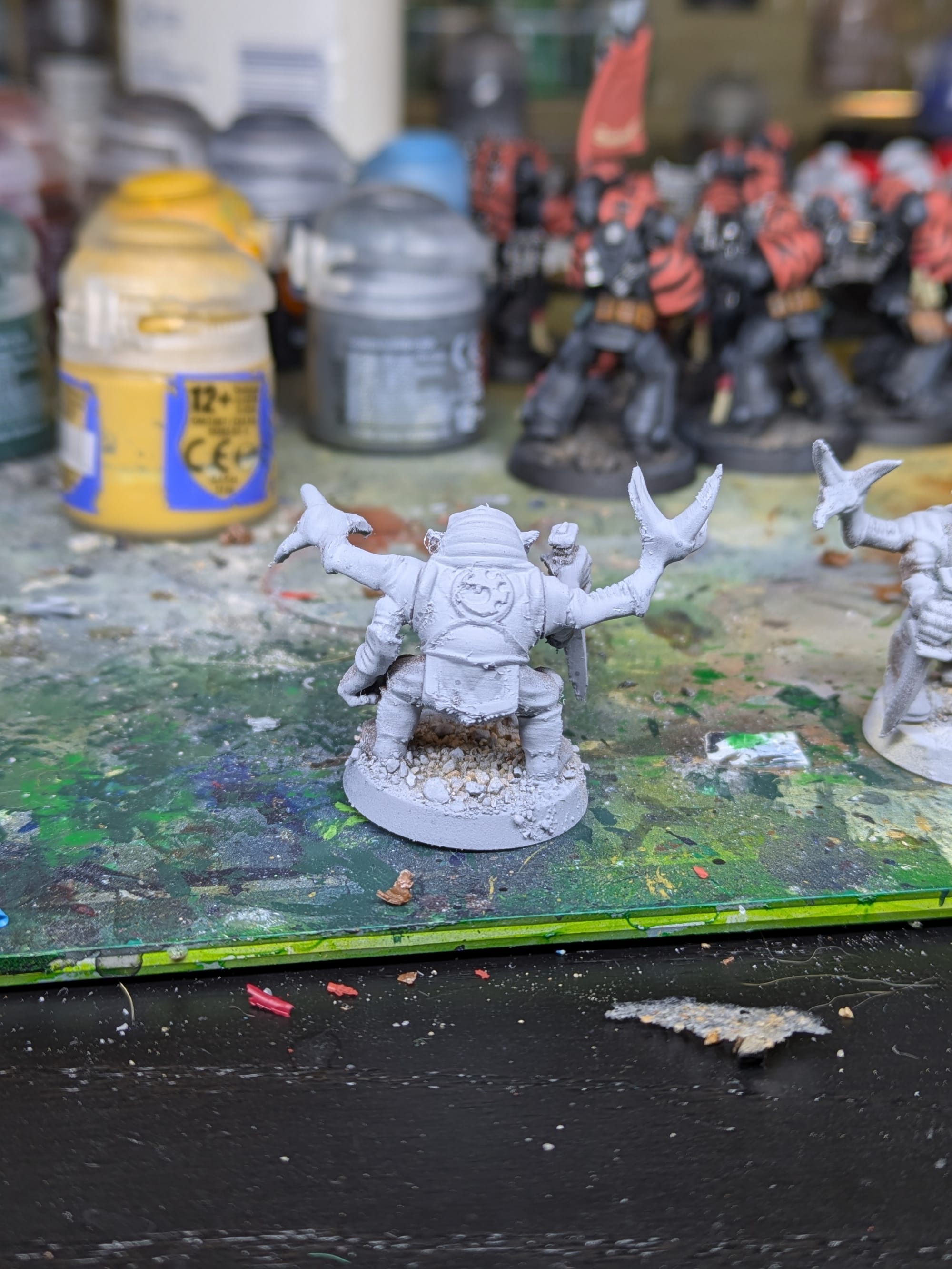
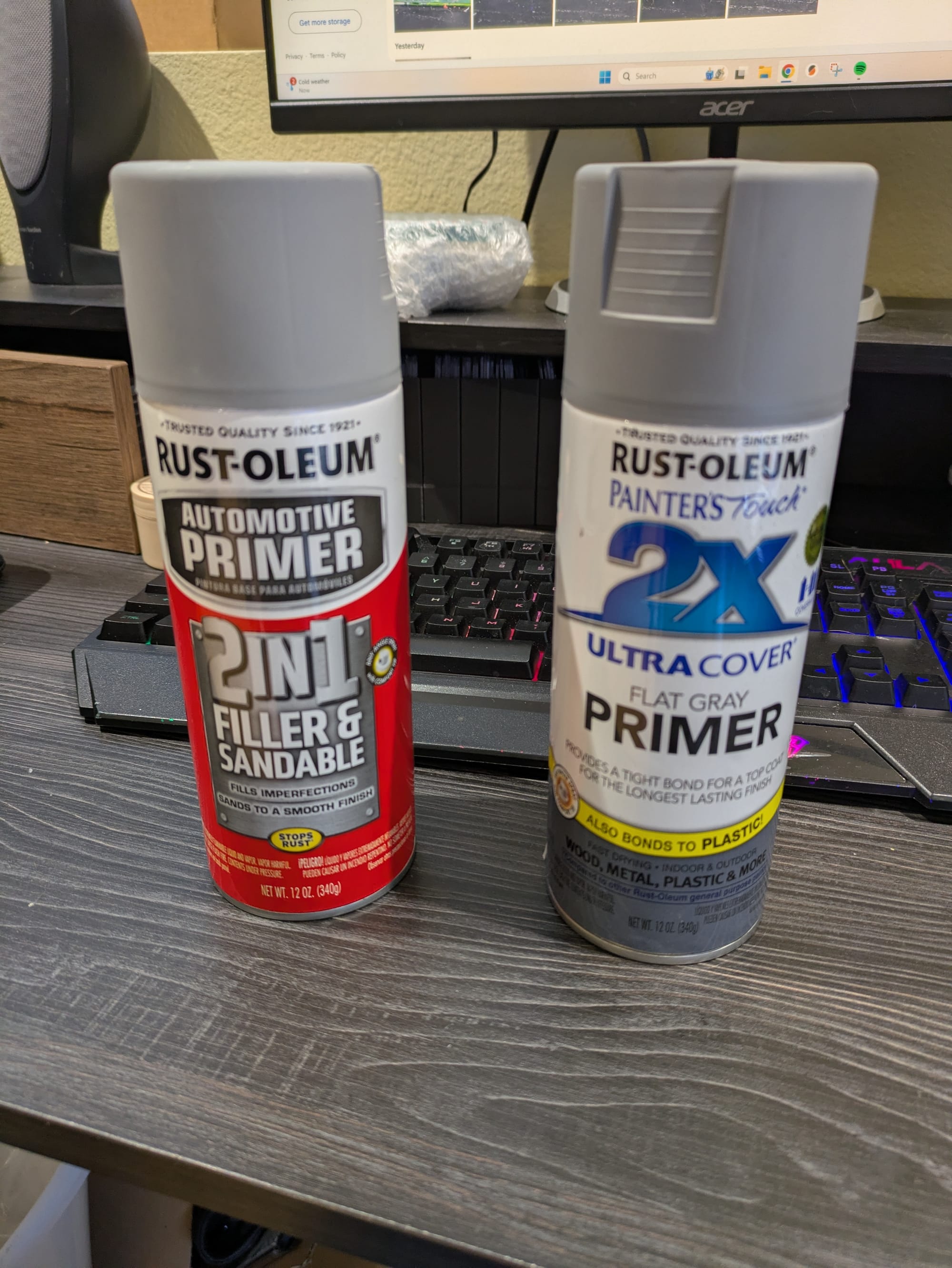
Standard primer is the more medium grey, Automotive Filler Primer is lighter gray
Well... I forgot to label the different models, and as you might have noticed, the two results look almost identical up close. Here is another picture lined up better with some drybrushing applied:
From my own eye's impressions, the filler primer did a good job hiding layer lines. I would say with the filler primer, the model looks overall more round and organic looking. One small downside of the filler primer is it caught on to strings easier, and I can tell I needed a more skillful application of it to the models.
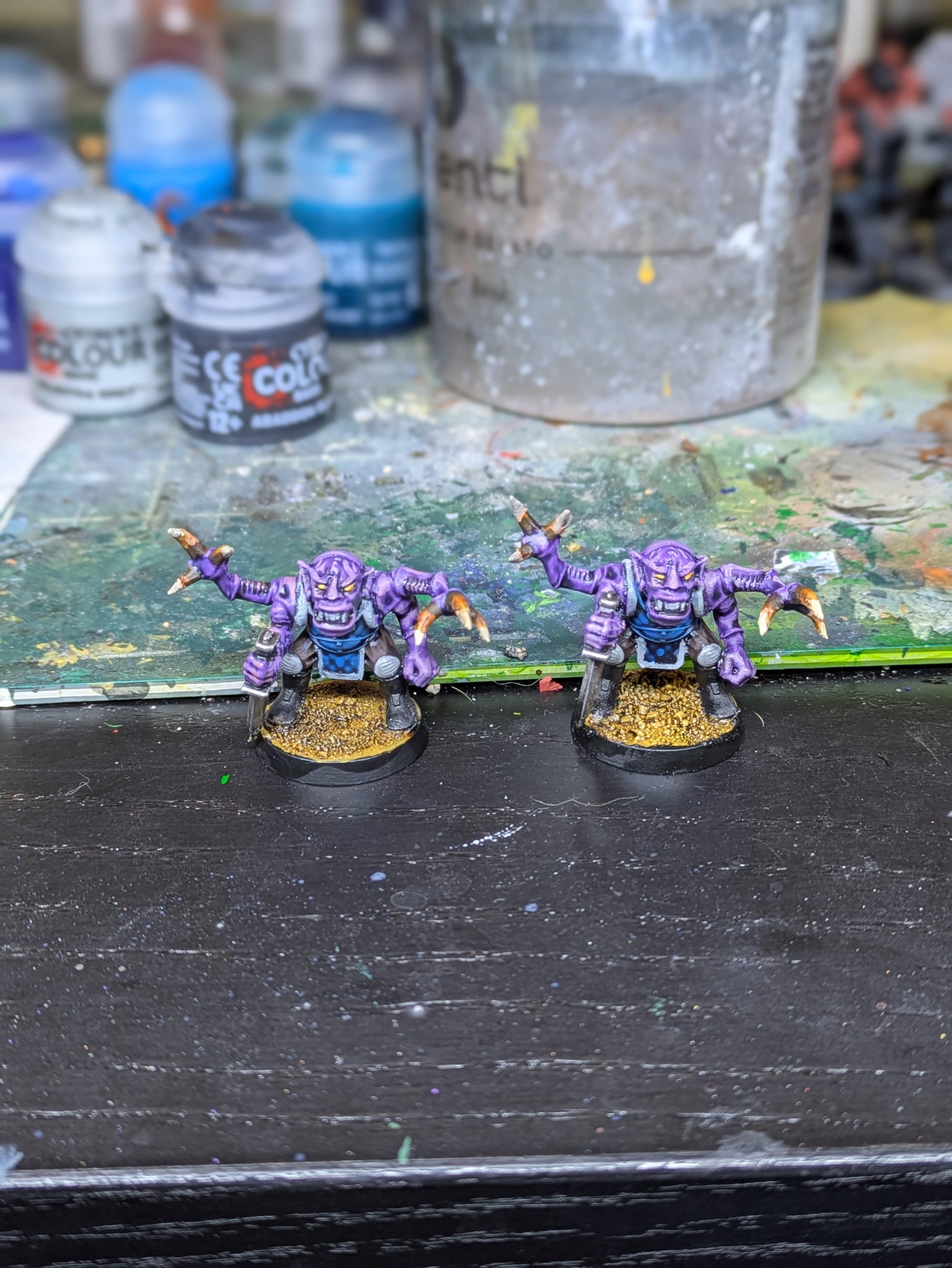
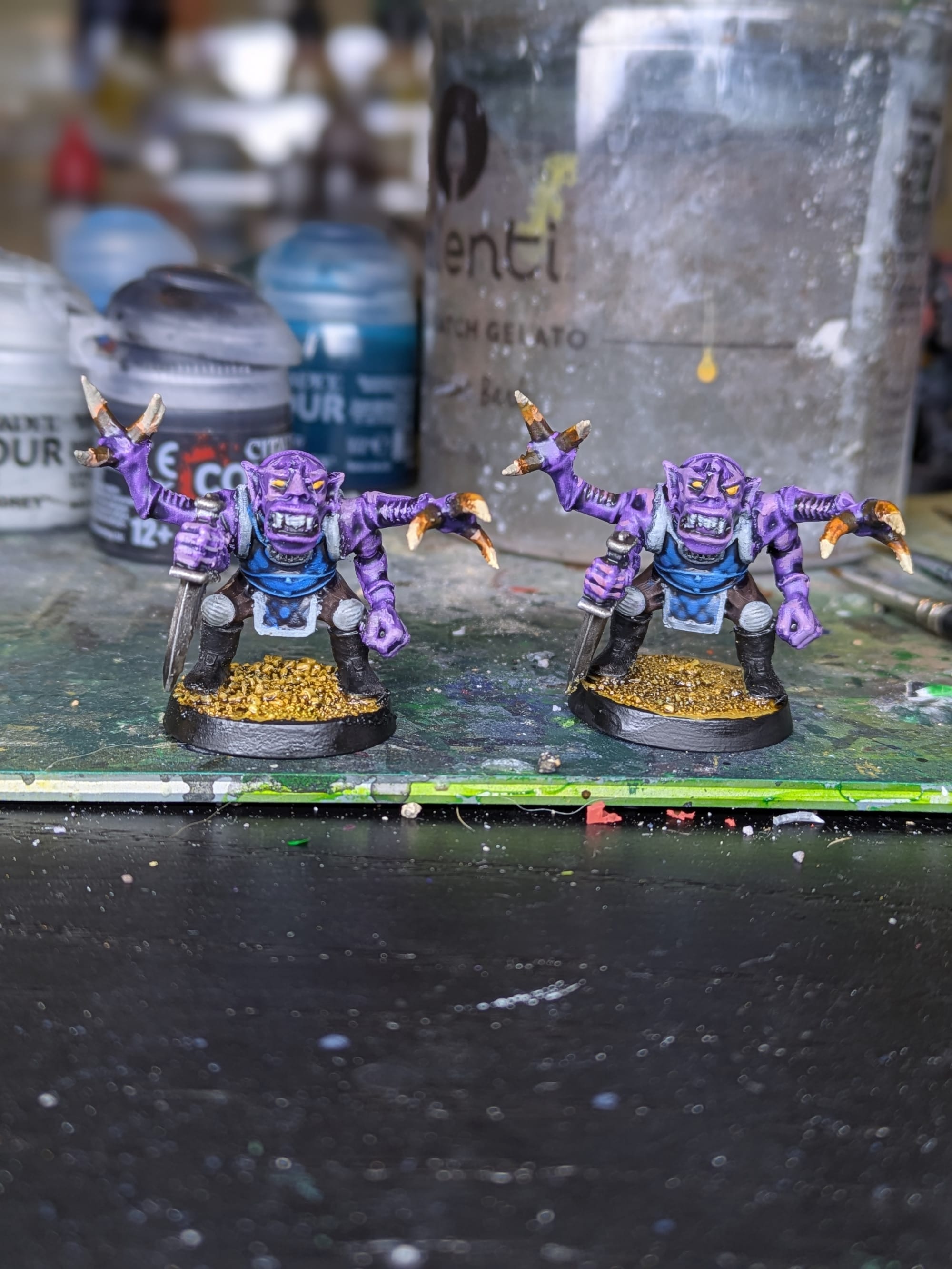
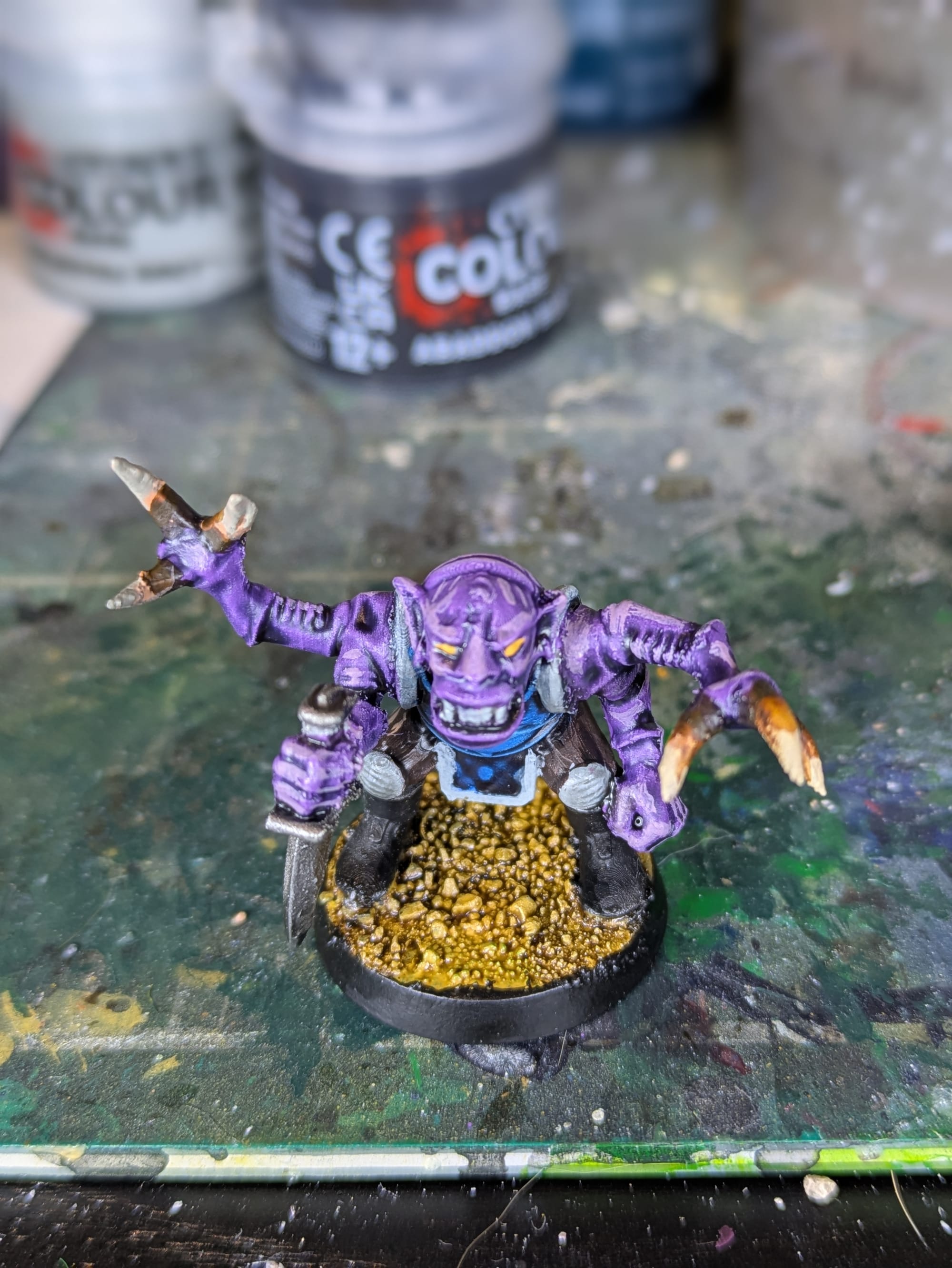
Painting with Contrast Paints
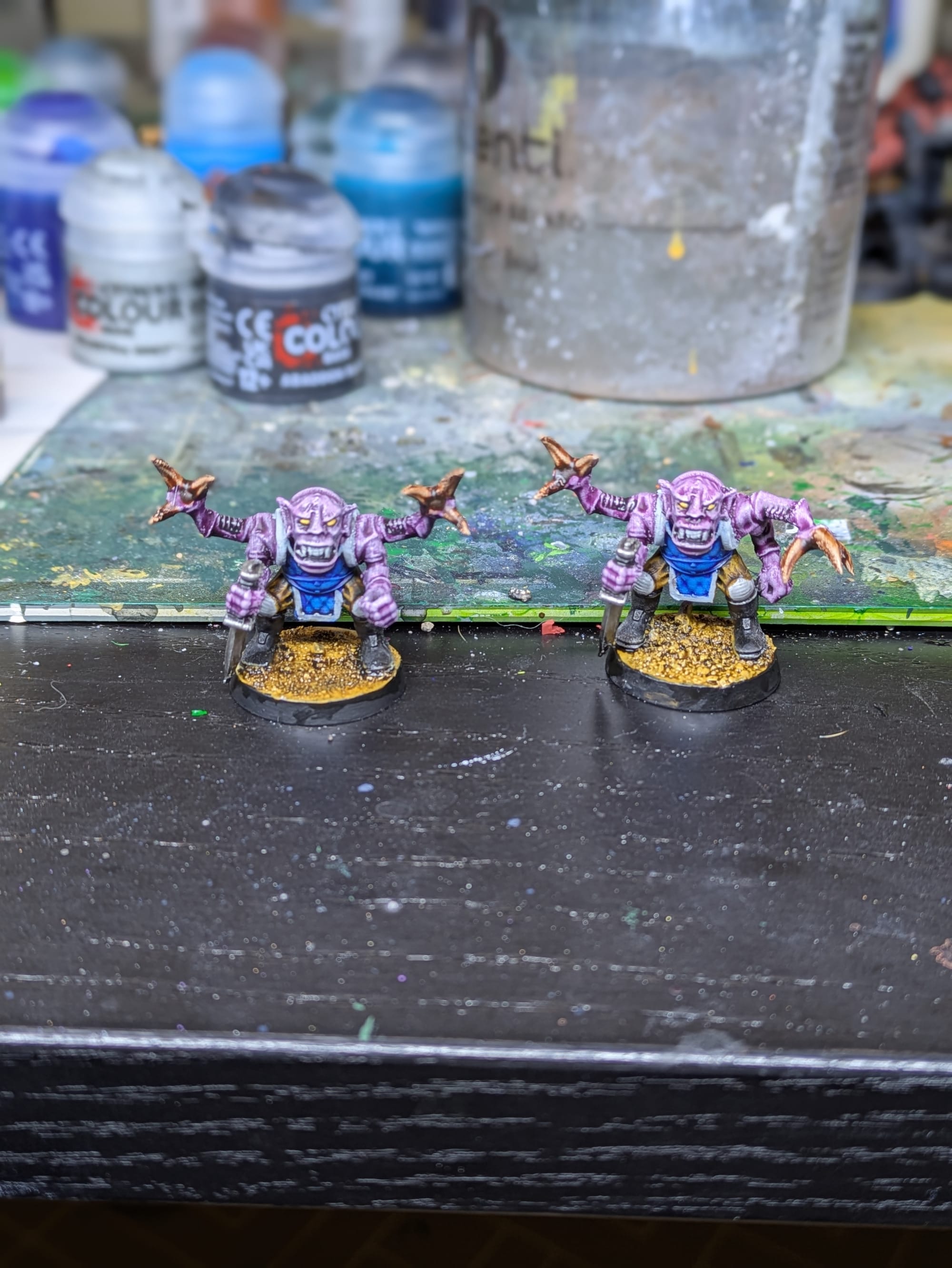
Standard on the left, filler primer on the right.
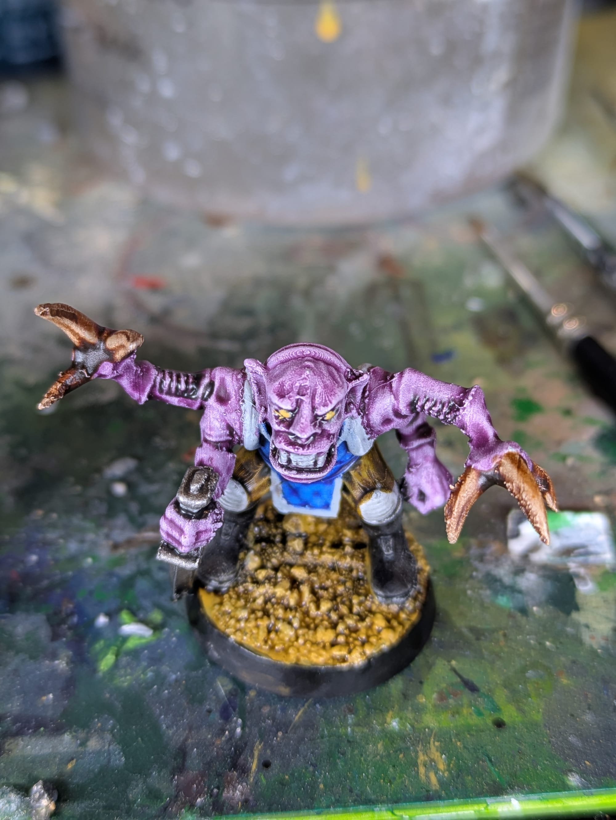
Contrast paint behaved exactly as expected on a standard-primed FDM surface. The paint flowed readily into recesses, but it also flowed into layer lines. On shallow curves, the texture was emphasized rather than hidden. The process was fast and efficient, and the results are quite good at tabletop distance. The underlying layer lines remain visible on the head up close.
On the filler-primed model, contrast paint did look slightly better. I'd say it results in a 5-10% improvement in the overall appeal. You can see on the up-close view below that model has fewer forehead layer lines, although they are still visible. Pooling felt slightly more controlled, and the softened surface reduced the harshness of the layer lines. That being said, the difference is extremely slight.
For those interested, I used Magos Purple and Talassar Blue as the main two colors. Snakebite Leather was used for the fatigues. Standard metallic paint was used for the knives, and Darkoath Flesh was used for the claws.
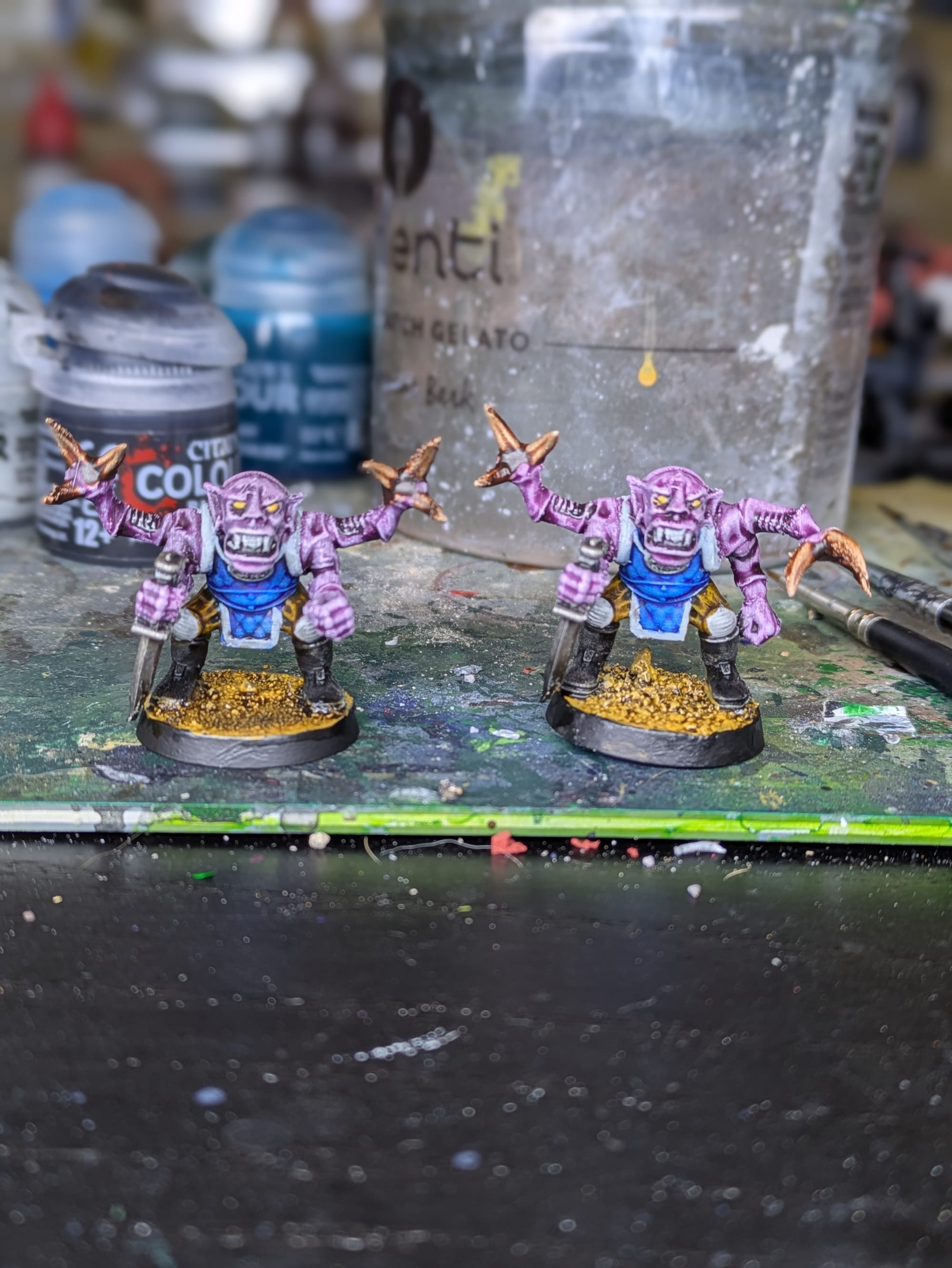
More close ups - Standard on the left, Filler on the right.
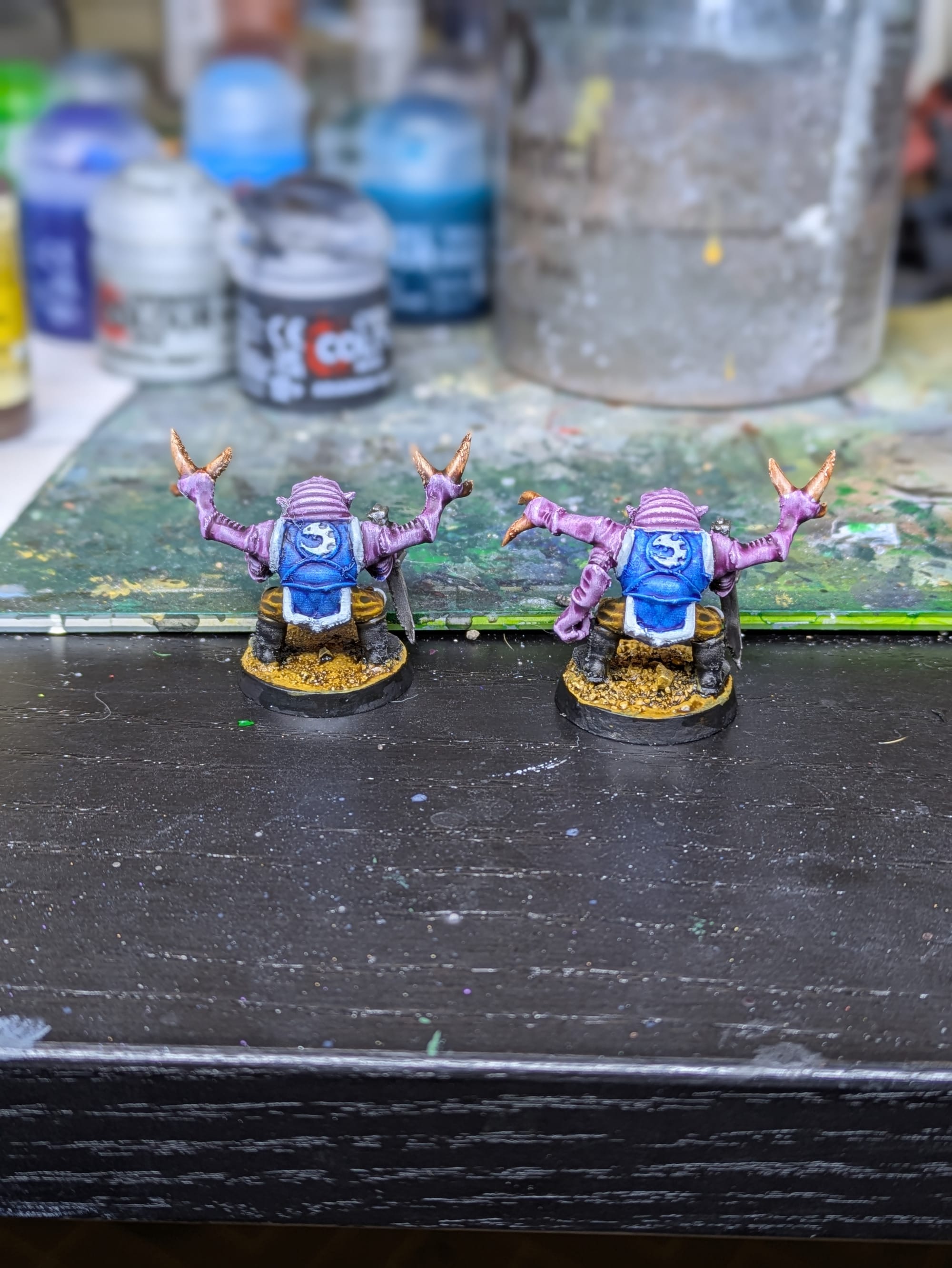
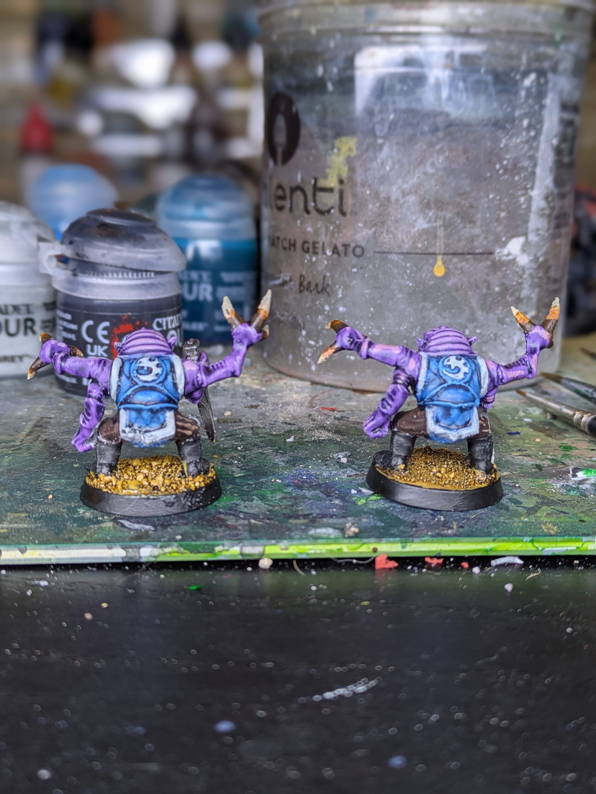
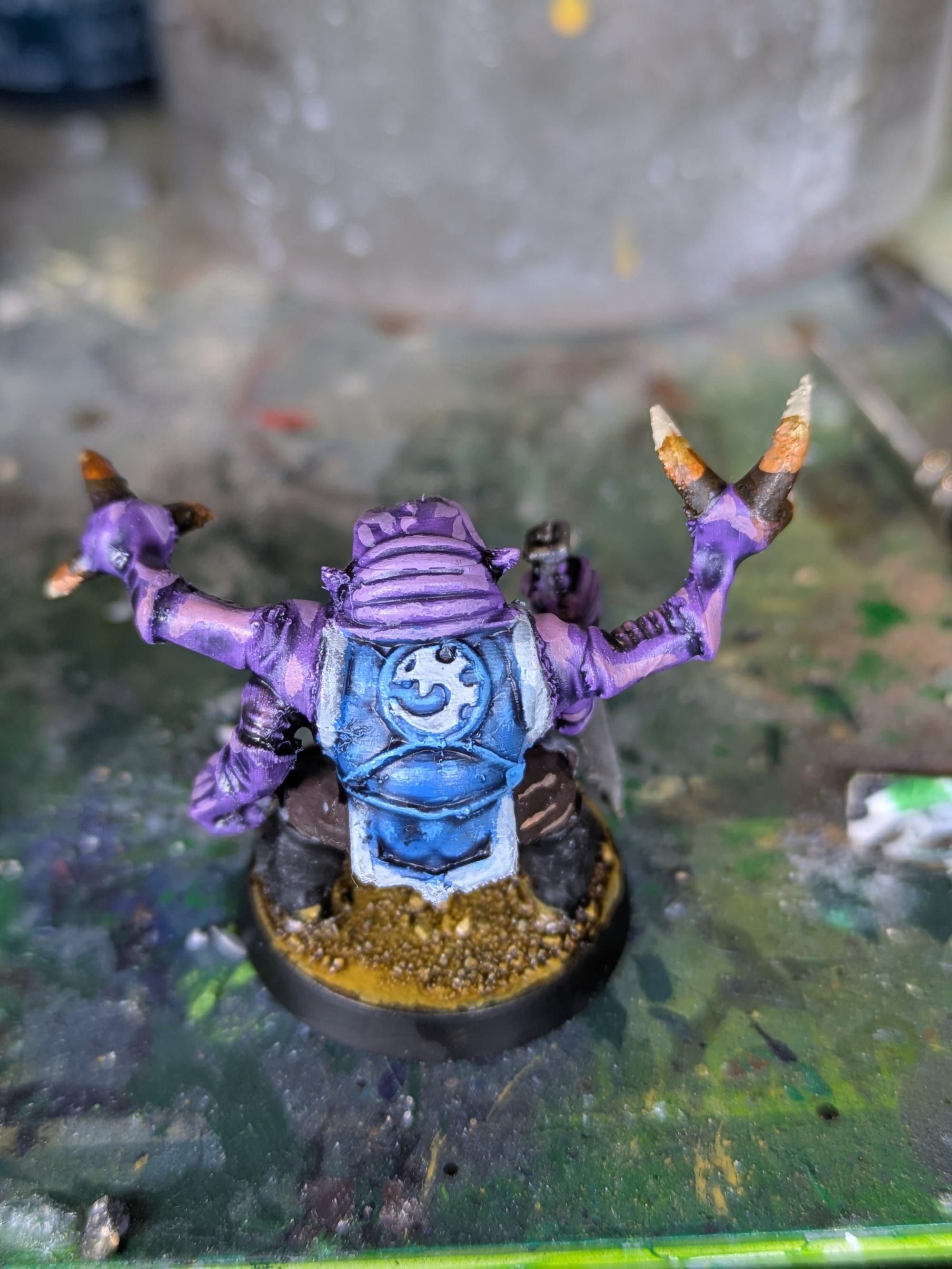
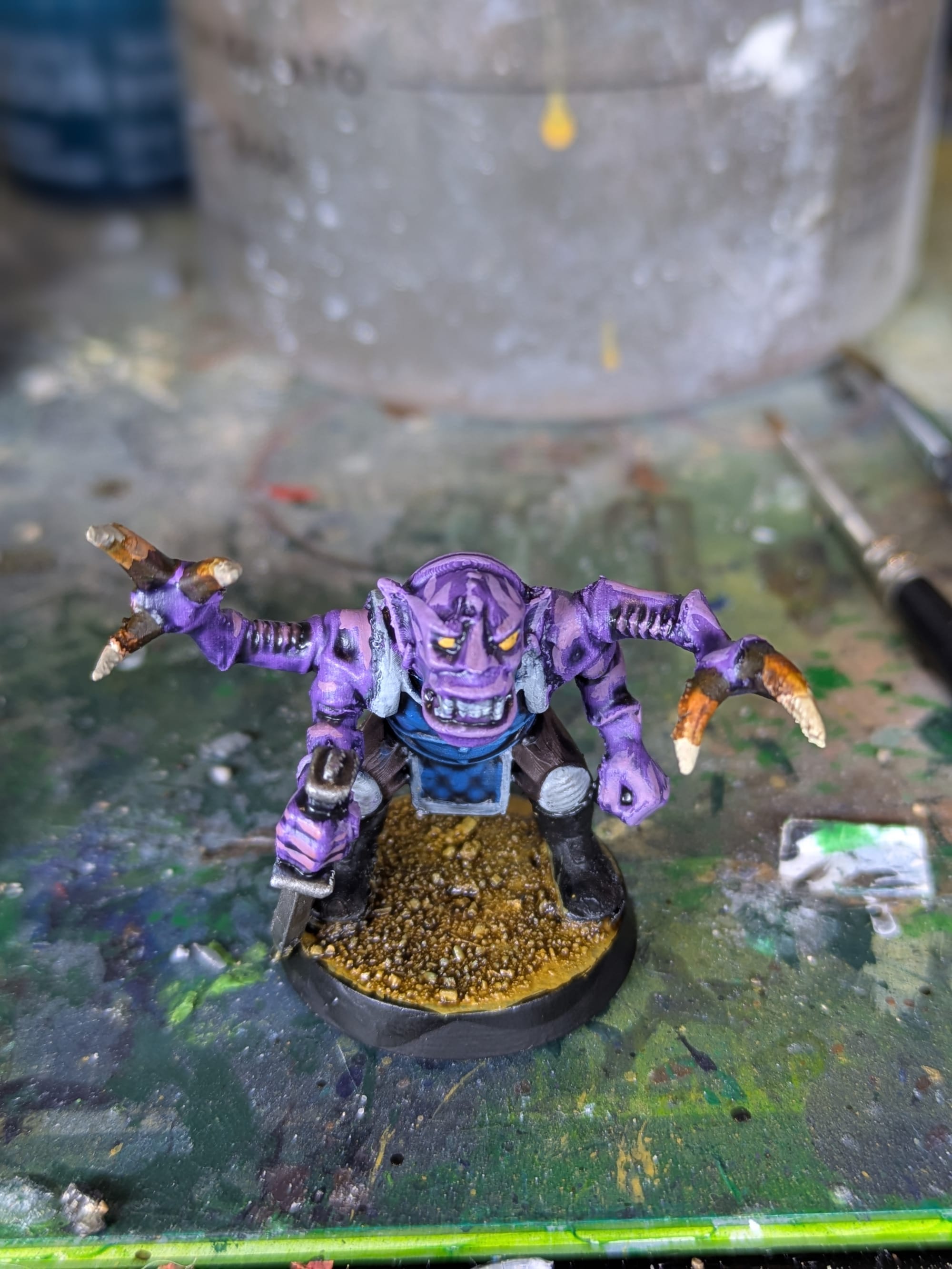
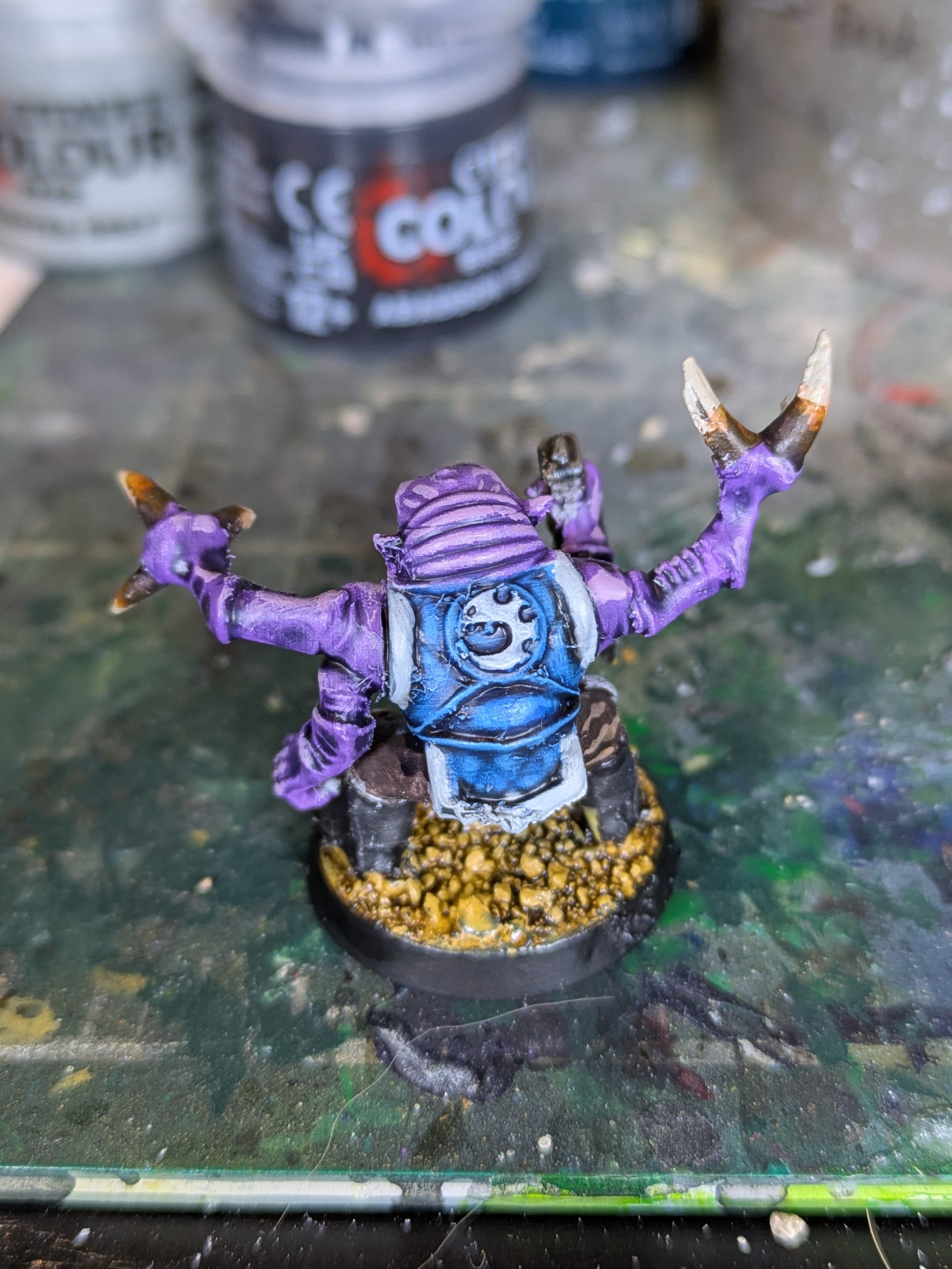
Painting with Traditional Acrylics
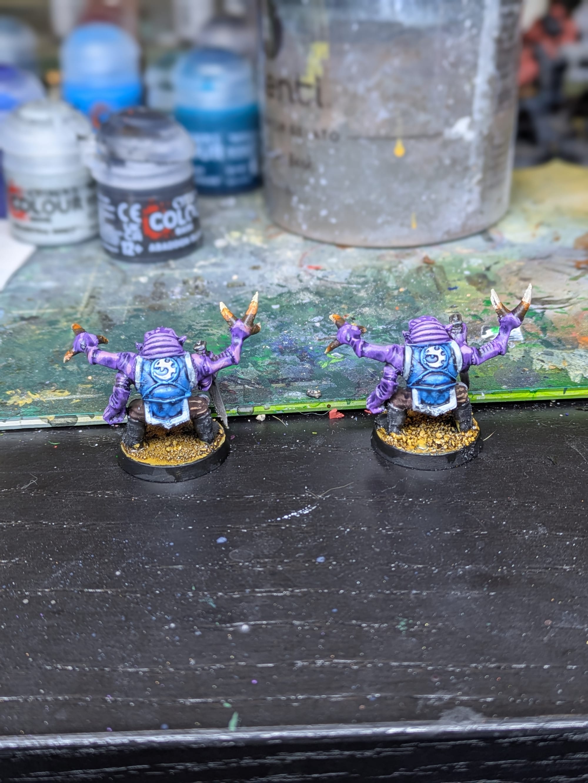
Standard primer on the left, filler primer on the right.
Traditional acrylic paints had a very nice overall effect, if you ignore any of my messy painting mistakes. An opaque basecoat reduced the visibility of layer lines nicely. Adding a highlight layer coat, moving along the raised areas, did a great job tricking the eye to ignore print layer lines. While the texture was still present, it's pretty much impossible to see except up close.
Filler primer made a smaller difference in this case. It did help, but the extra thickness of acrylic paint already hid layer lines pretty well. Any minor detail loss introduced by the primer was also irrelevant when highlights can draw the eye back to those points on the model.
For this, I mainly used Genestealer Purple for the Purple and Teclis Blue for the blue. I blended up to Rhinox Hide for the claws and fatigues, and went up to Ushabti bone on the claw tips. I made use of Drakenhof Nightshade blue wash to wash both the blue and purple.
Close ups - Standard Primer on the left, Filler Primer on the right
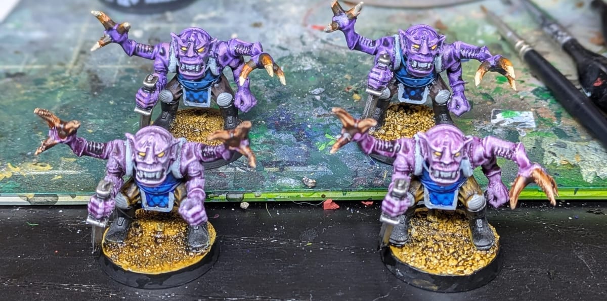
Side-by-Side Observations
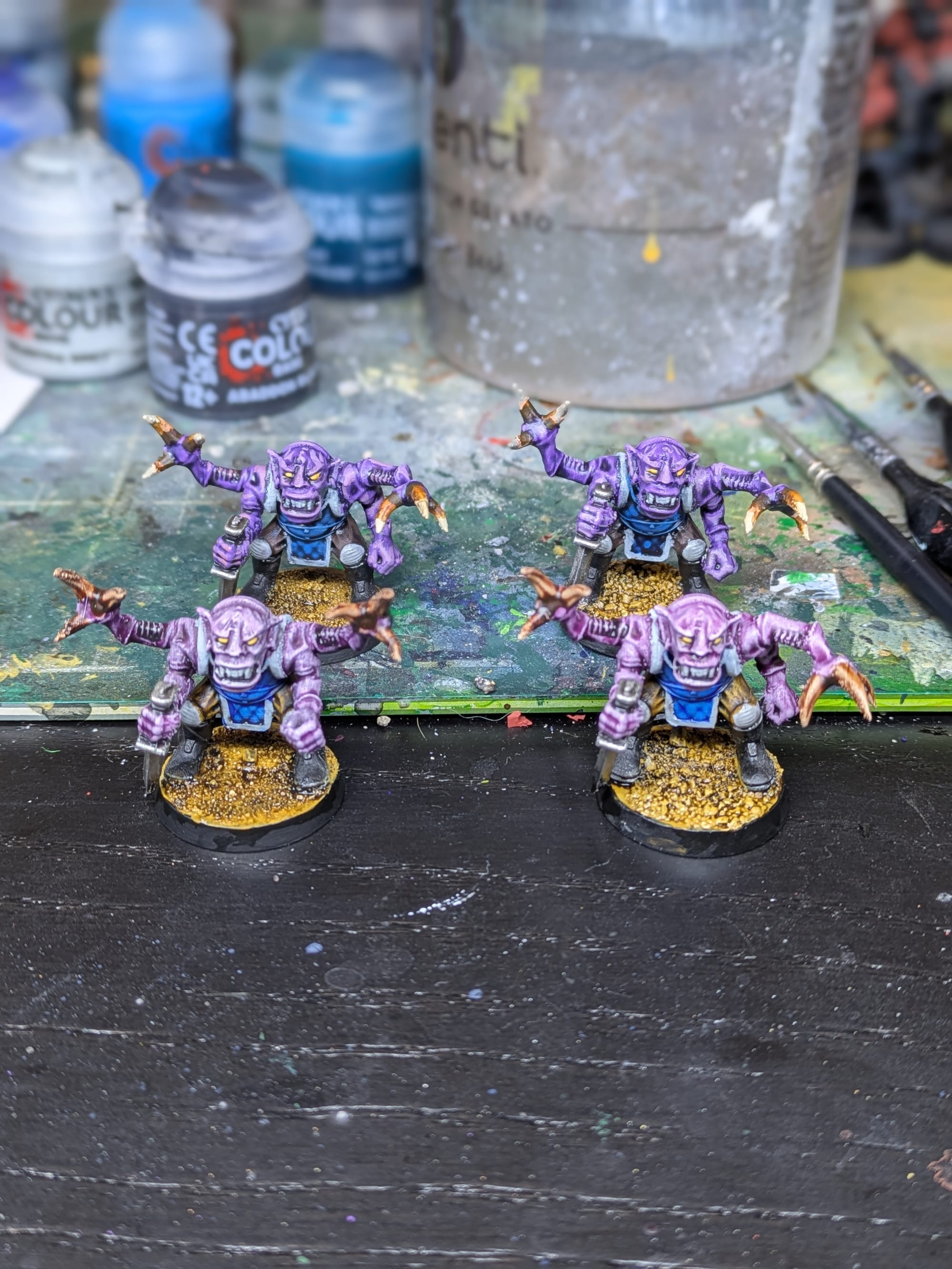
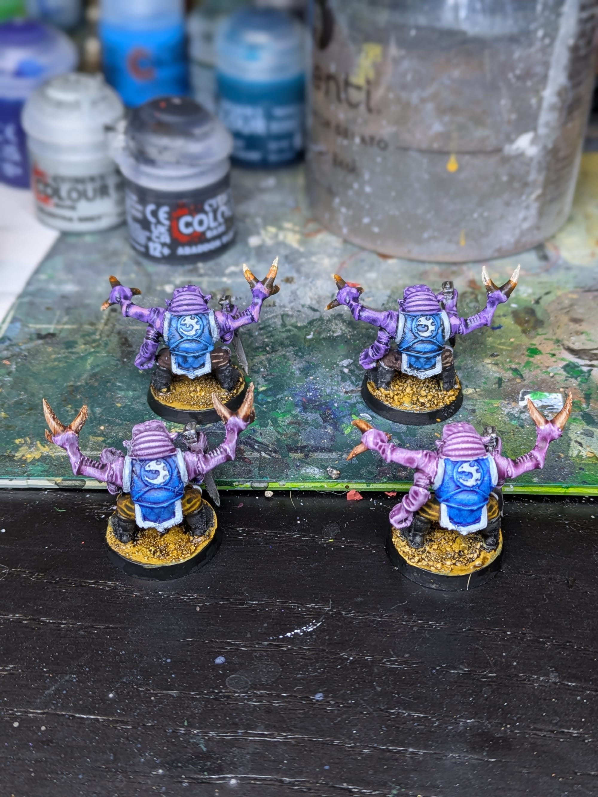
Contrast in front, acrylic in the back. Standard primer on the left, filler primer on the right.
Looking at the four models together, I feel that contrast did just fine here. I think I like the look of the normally painted models better, but only because they're more saturated. That's more a fault of Magos Purple contrast than anything else (it's notoriously under saturated.)
As you have probably noted this whole time, it's almost impossible to see the differences in any of these photos between the methods.
Final Verdict
Well, I think all the models look pretty good. In my opinion, having a well tuned printer and profile will do far more for end finish. Using strategic highlighting and shading will draw the eye towards the natural shapes of the model and does a lot to hide those pesky layer lines.
Using filler primer does result in modest reductions in layer lines and I will probably be using it for my own projects going forward.
Using non-contrast paint, especially on prominently visible curved surfaces, is probably worth it to hide layer lines. I will still be use contrast in many of my upcoming work to save the time, and I will probably try in the future to see if adding highlights to the contrast accomplishes the same goal.
FDM miniatures will never be resin, and they do not need to be. With realistic expectations and a thoughtful process, they can still look fantastic no matter which painting method you use. Thanks for reading and have a great day!
If this kind of hands-on experimentation is useful to you, consider subscribing (it's totally free!) I plan to continue exploring practical techniques to entertain, delight, and help you with your hobby.